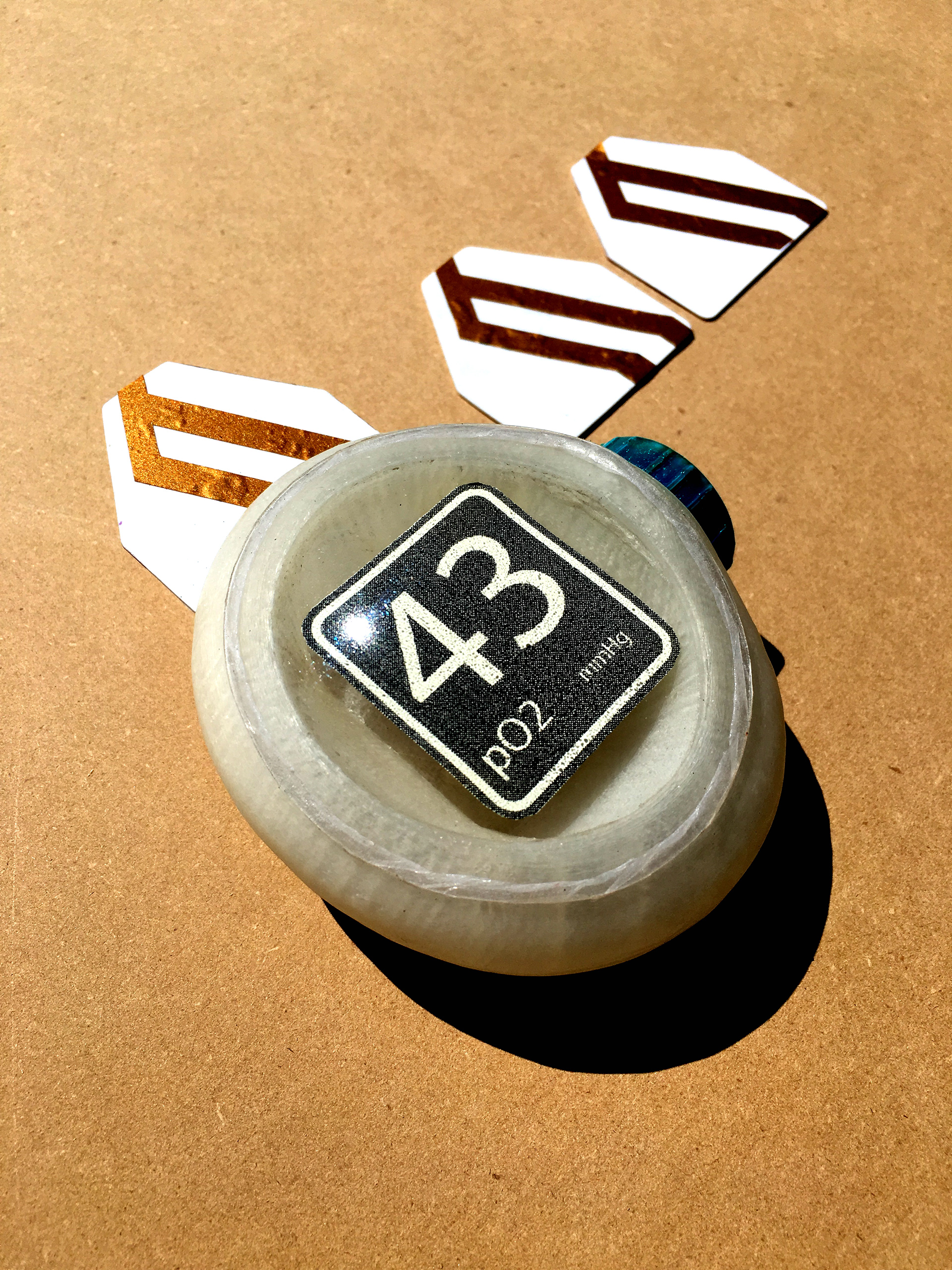
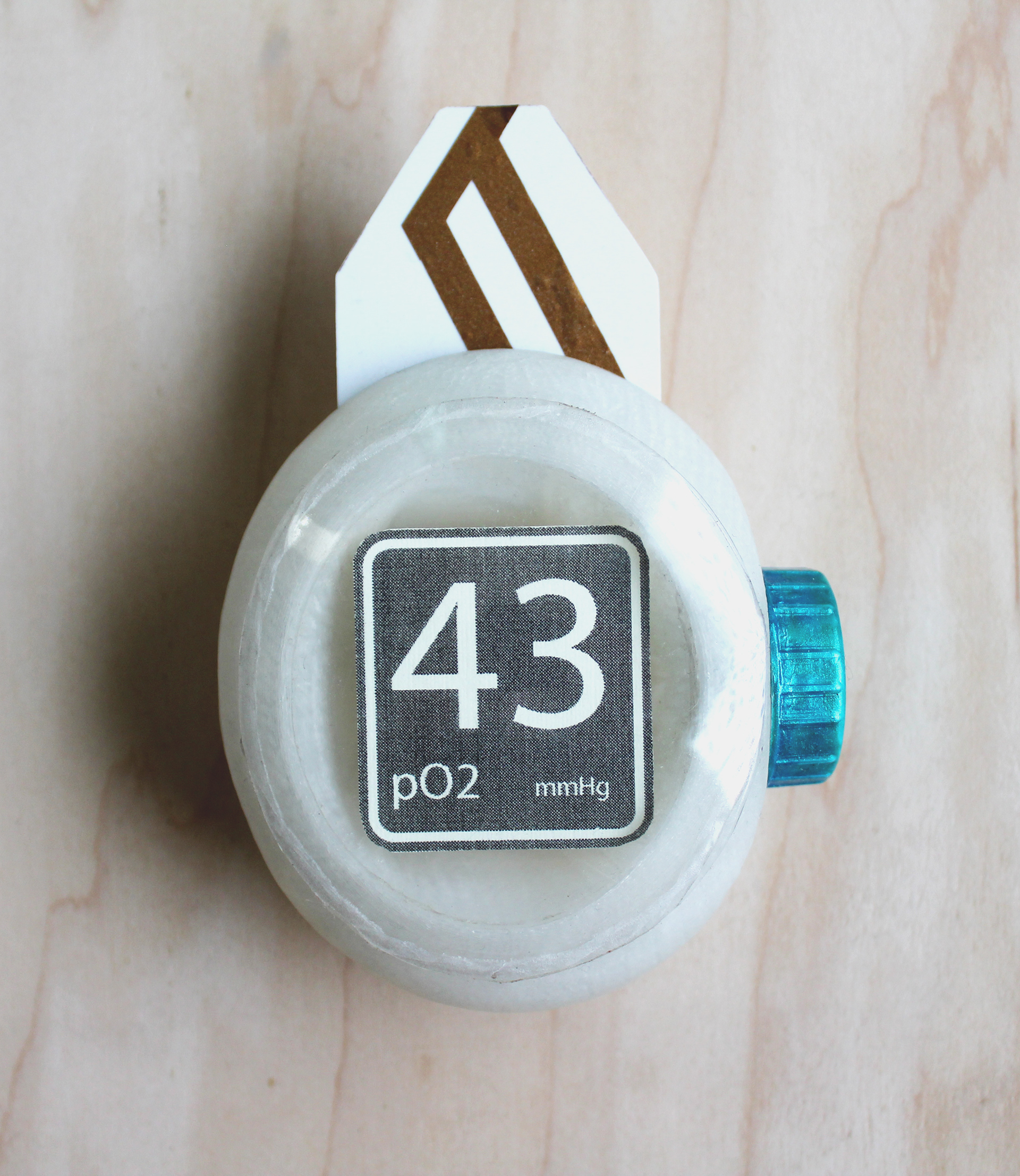
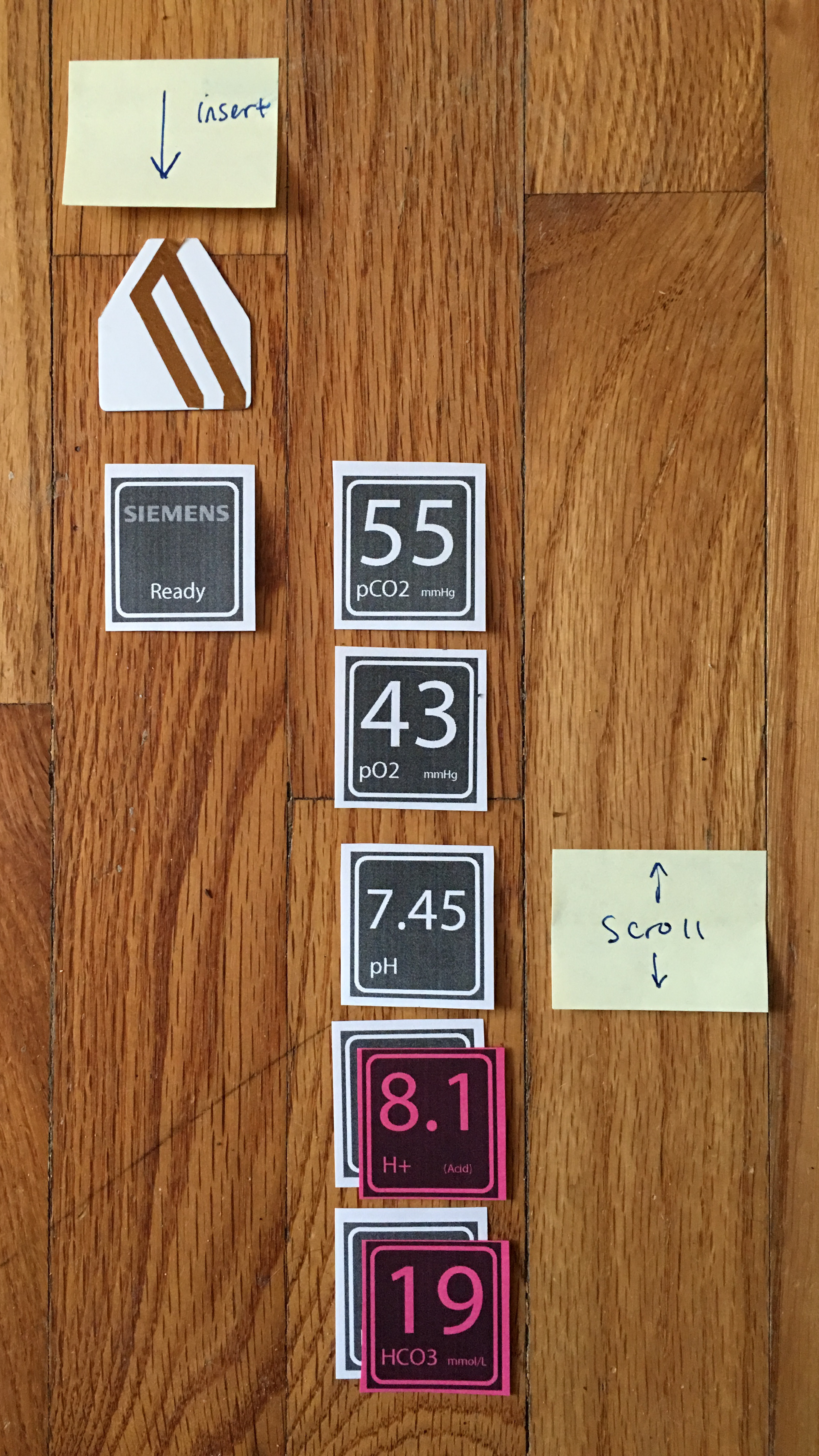
The phlebometer is a small device for quickly measuring and displaying an infant’s blood gas levels. When a baby is born, its foot is usually pricked and a droplet of blood is analyzed. This is for that situation.
In premature and complicated births, this can be a frantic situation. The phlebometer addresses this with a single-layer interface with one scroll wheel to flip through data. Data is ranked by need-to-know.
The device can scan the baby’s barcode bracelet and link the data to the baby. The info can be set to automatically export to other health-data monitoring software.
Familiarity Development
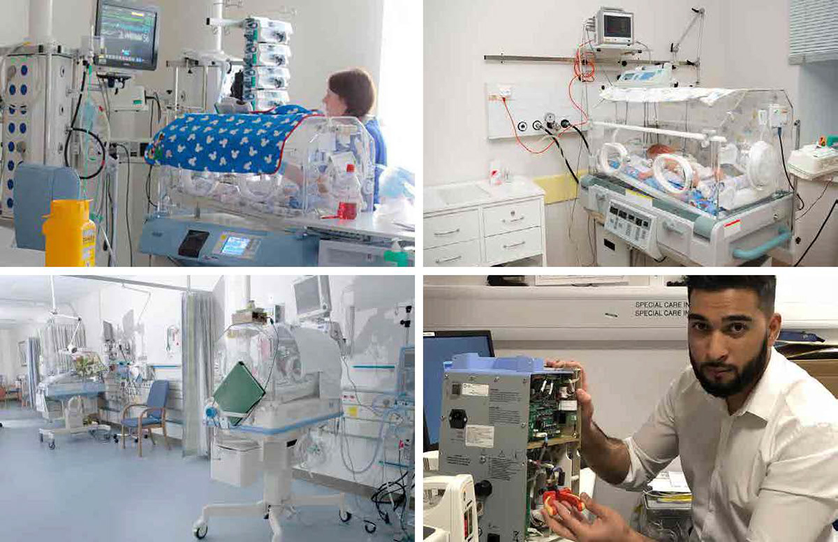
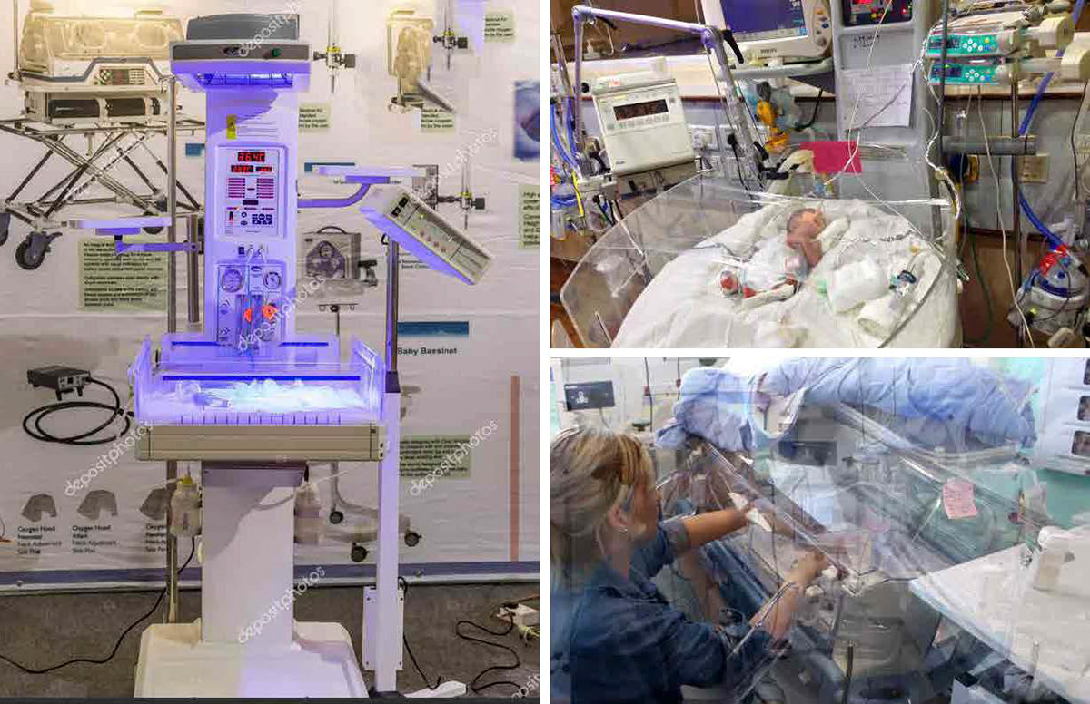
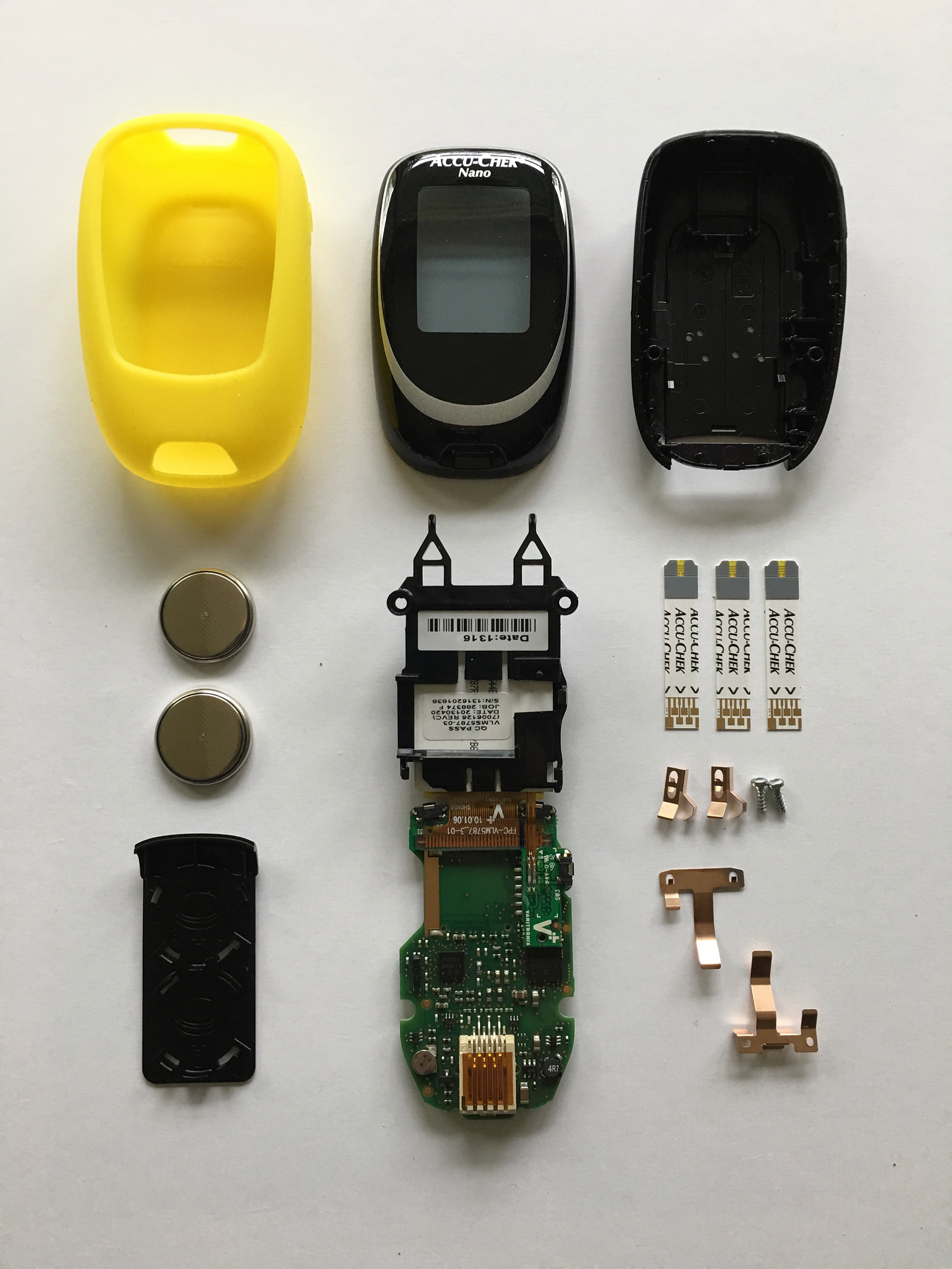
Visiting Hospitals, informational interviews with doctors, using medical devices, and disassembling medical devices were helpful in getting to know the environment. This thing would need to function in a germ-regulated environment. That reminded me of the various membranous creatures living in the sea and various nearby aquariums.
From that sprang a goal to keep the surface as simple as possible. The whole thing should be simple and intuitive, really.
Using some of IDEO's design thinking methods for idea development, I condensed free-range ideas into plausible solutions, then condensed hair-brained improvements into worthy upgrades. This cycle of condensing and expanding ideas to advance them is also the core of Design Council's Double Diamond.
Hidden Moment Analysis
This turned into a thought exercize that visualized the process of using the product. Of the insights gained, the most pertinent queston became “who?” Who uses this and who needs to know? Who will need to know the data later on?
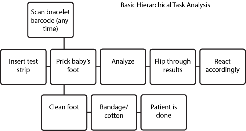
Hierarchical Task Analysis
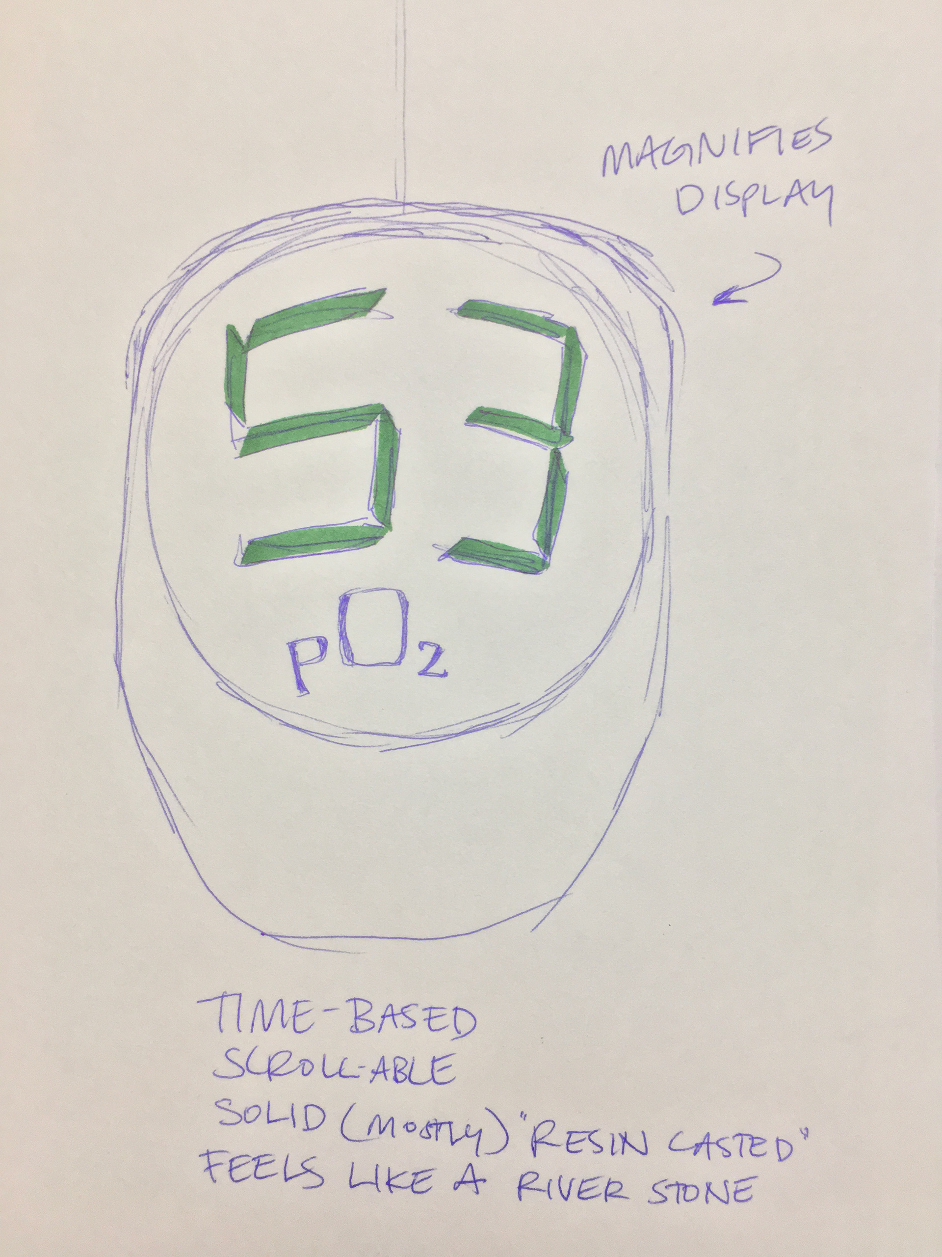
The order of the scroll-able data is important. The device starts with an “on” screen. When the blood sample has been processed, the first number pops up on the screen. The user can then scroll down to more numbers, in descending order of “need to know.”
The main idea here is simplicity.
Positional, Tangential, Curvature
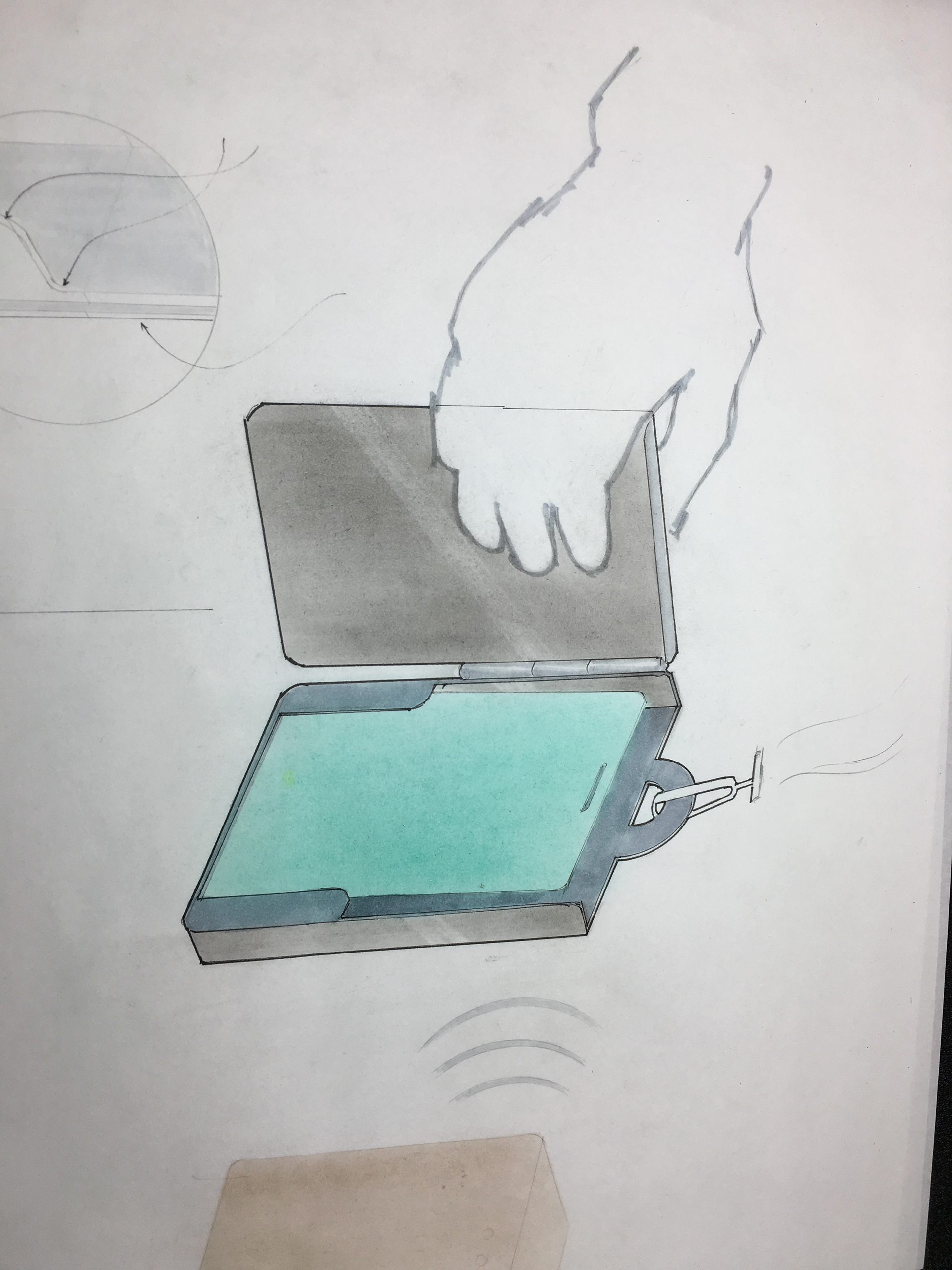
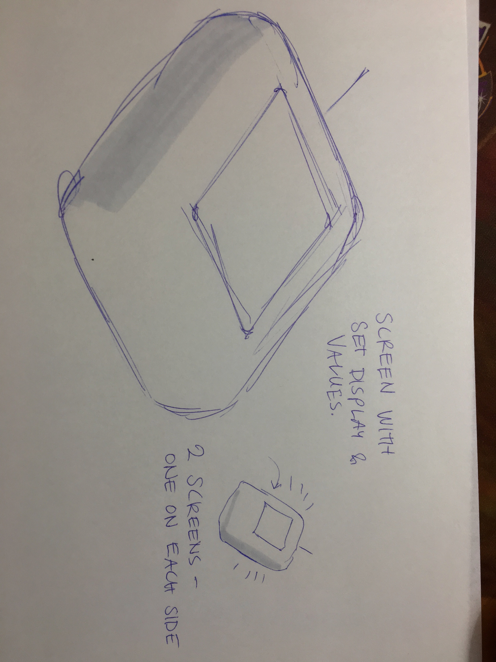
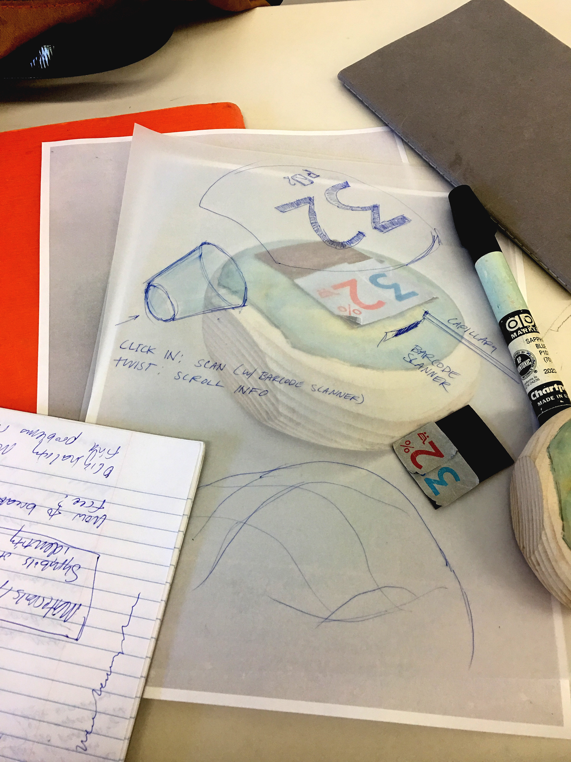
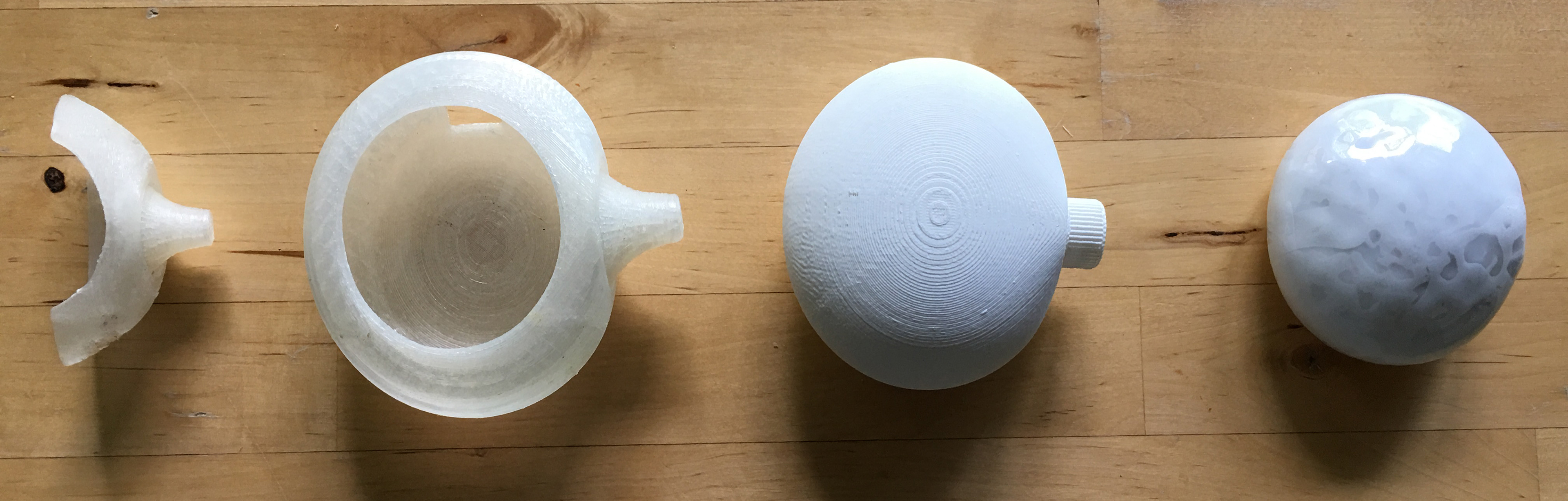
The design language is falling between tangential and curvature, as per Gray Holland's article on form language. While the shape is a curve, the screen and wheel are tangential. They are the user's interaction points. A third interaction point, the disposable insert, is positionally styled to set it apart. I used similar styling to create associations between the wheel and the screen, and to separate the permanence of the phlebometer from the impermanence of the disposable blood strip. (The strip functions the same as the strip in a glucometer.)
Thinking Aloud...
It would be nice if...
...The charging/sync cable were combined into the same slot as the disposible test strips.
...When a test strip is inserted, it also turns on the device. There is no need for an on/off switch, because this action takes place at the same time.
...It were submersible in cleaning solution.
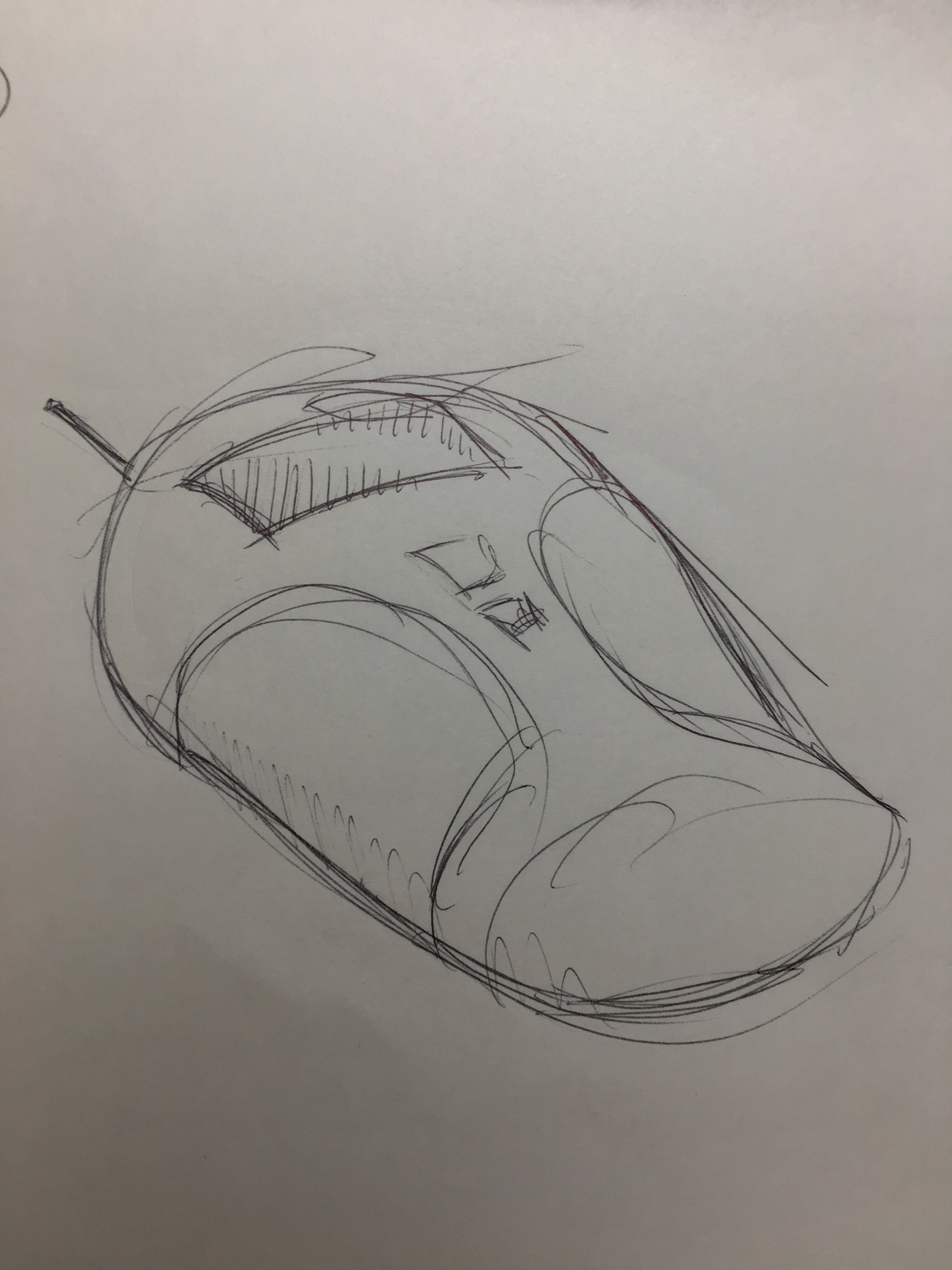
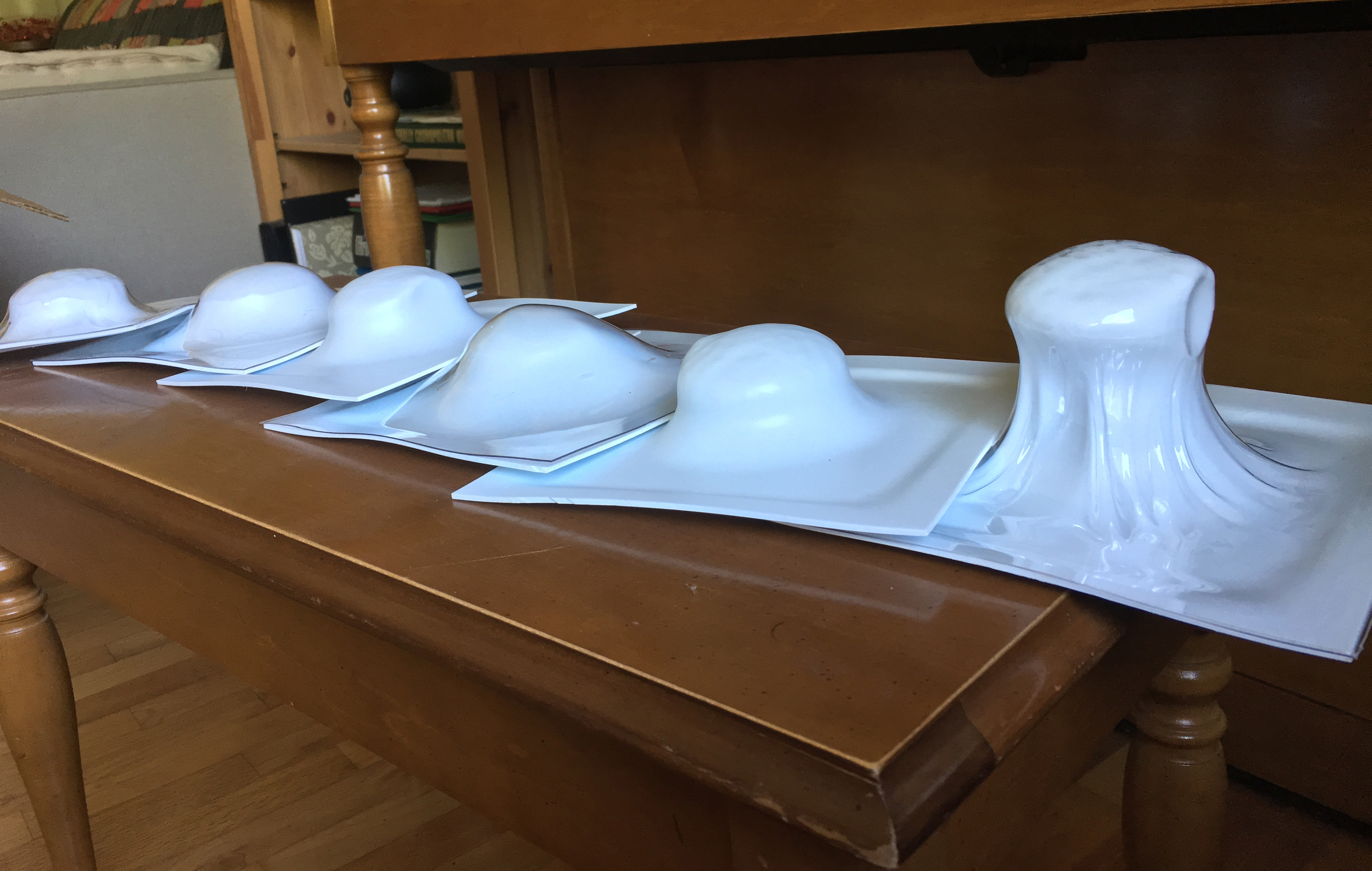
Iterative Form Development
At first it was too small. Then it was too big. Then it was too small again. Getting the right form seemed to take time, and I don’t feel done at all. I’m sure I could spend another month doing more prototypes.

Reflections
I think the knob is an area that needs attention. I think the knob axis needs to be turned 90 degrees so that it works like a scroll wheel rather than a knob. This would keep the fingers from getting in the way of the screen and better facilitate one-handed operation. Overall, I’m happy with the form development and I feel like it’s not too derivative.